 Why do they call Sans Serif fonts ‘Grotesque’ or ‘Gothic’ ? Find out and meet some of the founding fathers in this part five of the “Brief History of Typography” by Thomas Phinney. Continuing from the previous page, Part Four of “A Brief History of Typography”
 Sans Serif (a.k.a. Gothic or Grotesque)
These “ugly” type forms made their first appearances around 1815-1817. Both are marked by simpler letterforms with (usually) relatively uniform stroke weight, lacking significant contrast, often geometric in underlying design. The term “sans serif” (sometimes spelled as a single word, sansserif or sanserif, which is incorrect!) means without a serif.
The earliest forms of sans and slab typefaces tended to be heavy, often monolithic, display faces, but there quickly evolved a wide range of styles. Although the earliest designs are not much used today, their descendants are common enough. The introduction of the sans serif caused quite a stir in the typography and publishing worlds because of the dramatic departure from the Romans or serif fonts which dominated publishing. This gave way to referring to sans styles as “Grotesque” … ugly, incongruous, unpleasant, or disgusting! Yet, in the art world, grotesques are ornamental arrangements of arabesques with interlaced garlands and small and fantastic human and animal figures, usually set out in a symmetrical pattern around some form of architectural framework — more specifically, the grotesque forms on Gothic buildings, . Learn more about this in the Wikipedia
Sans serif letters have no serifs, as the name suggests.
The low contrast and absence of serifs makes most sans typefaces harder to follow for general reading. They are fine for a sentence, passable for a paragraph, but are difficult to use well in, say, the text of a book. The terminology of sans serif types can be confusing: essentially, gothic or grotesque are both generic names for sans serif (although Letter Gothic, confusingly, is more of a slab serif type).
In sans serif faces, the italics are often, although not always, simply a sloped (mechanically obliqued) version of the roman letters, making them totally subordinate to the roman.
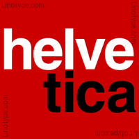
By far the most common sans is Helvetica

… by Max Miedinger, despite being abhorred by many typographers. Helvetica does have the advantage of coming in a huge range of weights and widths, which makes it versatile, and its ubiquitous character makes it easy to match.
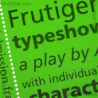
As you know, Helvetica is by no means the only sans serif — there are literally tens of thousands of others — primarily because they are more easy to design and cut than the serifs! Within the broad spectrum of sans serif faces the other popular, general-purpose sans serifs include Univers (Frutiger, 1952+), Arial (Monotype), Franklin Gothic (M.F. Morris Fuller Benton, 1903) and Frutiger (Adrian Frutiger, 1975).
Sprouting from the Art Deco movement in the 1920s and 30s (see Art Deco, later in this history), radical geometrical shapes began to be used as the basis for sans serif designs.

There are a few other common sans faces which do not fall cleanly into the above categories. Eric Gill‘s 1928
Gill Sans has an almost architectural quality, and its greater contrast and humanistic design makes it better-suited than most sans serif typefaces to setting bodies of text. The same can perhaps be said of a number of late 20th Century humanistic sans faces.
We could supply a listing of other Sans Serif fonts, but since it would be difficult to select which ones — out of thousands — we know you can come up with several hundred, probably on your computer right now.
NEXT : Slab Serifs, or Egyptian Type Styles“
See 68 of the fonts mentioned in this History of Typography in our Typography Gallery
thanks for reading
![]()
Editor/Publisher : DTG Magazine
Published online since 1988
This page was originally published at : https://graphic-design.com/wp-content/uploads/graphic-design.com/Type/history/sans_serif_type_faces.html