 In part seven of our History of Type, we’ll look at the script, brush, italic and freehand styles that everyone loves. From basic handwriting to steel brush, to digital calligraphy, the classification is called “scripts”
Continuing from the previous page, Part Seven of “A Brief History of Typography”
 Script typefaces are based on handwriting; but often this is handwriting with either a flexible steel nib pen, or a broad-edged pen, and is thus unlike modern handwriting. Script found its origin in the quill pen, made from the flight feather of a bird. These pens were carefully but at an angle, then slit down the middle. Inks would pool in the shank of the feather ‘quill’ and the slit would feed ink uniformly to the point. A skilled penman could vary the strokes from very wide to hair-line thin by merely applying more pressure to the point. Later, these “nibs” or pen points were made of brass in varying thickness and point sizes. In the late 1920s, steel and brass nibs were manufactured in mass and popularized by “Speedball” for sign lettering.
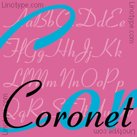
 With the advent of the letterpress, and later ‘lead type’ these hand-lettered alphabets were carefully carved, then punch-cut into “fonts” for the industrial revolution’s mechanized printing industry. These fonts were often referred to as “Engravers” scripts because of their likeness to engraving. Some common scripts based on steel nib and engravers styles include Shelley (Carter, 1972), Coronet (Middleton
, 1937-38), and Snell Roundhand (Matthew Carter, 1965, based on Snell ca. 1694).
Script faces based more on the broad-edged tradition of chisel-point and steel brush styles include the contemporary Park Avenue.
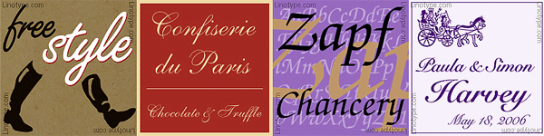
 There are also monoline scripts
 There are also monoline scripts
These scripts resemble a sign painters single quill lsttering, which lack significant contrast in the letter strokes. One such is Freestyle Script.
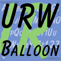
Brush typefaces look as if they were drawn with a brush, which most of them were, at least in the original design from which the metal/film/digital face was created. Some of them resemble sign-painting lettering, such as the original Balloon (Kaufmann, 1939), Brush Script (Smith, 1942), and Dom Casual (Dom, 1952). These were originally created by long, soft brushes known as lettering quills. The industry standard are the Langnickel brushes.
Modernized Scripts
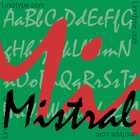 Brushwork can also be the basis for more modernized scripts, as with Present Script (Sallaway, 1974) and Mistral (Excoffon, 1953)
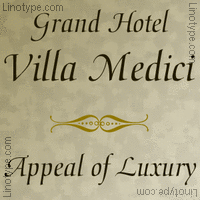 Although modern typography typically relegates the italic to a second-class citizenship subordinate to the roman, there are still some italic typefaces designed as such in their own right. This style can be associated with the Calligraphic styles, because it most often resembles calligraphy as created by a chisel-point pen or brush. The best known is doubtless Zapf Chancery (Hermann Zapf, 1979). Others include Medici Script (Zapf, 1974) and Poetica (Robert Slimbach, 1992).
Many of the most interesting typefaces of the twentieth century does not fit any of the above categories, or at least not easily. The reason is that they reflect not merely a single style, but cumulative experience, and the merger of different styles.
NEXT : Synthesis Font Styles of Modern times
See 68 of the fonts mentioned in this History of Typography in our Typography Gallery
thanks for reading
![]()
Editor/Publisher : DTG Magazine Published online since 1988
Don’t forget … we encourage you to share your discoveries with other readers:
![]() Send an email to our editorial staff
Send an email to our editorial staff
![]() Follow DTG on Facebook!
Follow DTG on Facebook!
![]() PIN THIS with DTG on Pinterest
PIN THIS with DTG on Pinterest
![]() Fred Showker, Design on pinterest
Fred Showker, Design on pinterest
This page was originally published at : https://graphic-design.com/wp-content/uploads/graphic-design.com/Type/history/scripts_pen_brush_quill.html