![]() In this part six of the series, we look at one of the most beloved classifications — yet probably the most over-used generas: Decorative & Display Typestyles : Wood Type, Art Nouveau, Art Deco, Fat Faces and more
In this part six of the series, we look at one of the most beloved classifications — yet probably the most over-used generas: Decorative & Display Typestyles : Wood Type, Art Nouveau, Art Deco, Fat Faces and more
Continuing from the previous page, Part Six of “A Brief History of Typography”
Wood Type
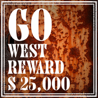 Wood type answered some of the needs of display advertising during the industrial revolution. It derives its name from the fact that instead of being made of metal, the type is carved from wood, cut perpendicular to the grain. It is distinguished by strong contrasts, an overall dark color, and a lack of fine lines. It may be unusually compressed or extended. (At left you see an example of wood type, as being restored by the folks at BriarPress.org)
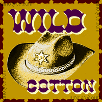 Many wood types have an “Old West” feel, because they are most strongly associated with America in the
  1870-1900 period. Some of the wood types most widely available today are those in an Adobe pantheon released in 1990, which includes Cottonwood, Ironwood and Juniper (Buker, Lind & Redick see lots more at the Edinburgh City of Print Flickr stream).
Art Nouveau
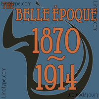
 The late Victorian era, from 1880 to World War I, was characterized by this ornamental style of art, with its organic, asymmetrical, intricate and flowing lines. This “Art Nouveau” (French, meaning “new art”) produced similarly distinctive typography, which saw a revival during the 1960s.
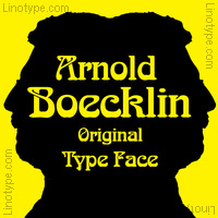
 There are a fair number of digital revivals of art nouveau faces, although few are widely used. Some of the more common digital art nouveau typefaces are Arnold Boecklin (Weisert, 1904), Artistik, Galadriel and Victorian.
Over the years we’ve written extensively about the Art Nouveau forms of type, fonts and art. See: William Morris: Art Nouveau Style, shareware Art Nouveau fonts!
Art Deco
 If Art Nouveau was about finding beauty in organic intricacy, Art Deco was perhaps about finding beauty in geometric simplicity. First appearing in the 1920s and 30s, Art Deco made a comeback in the 1970s and 80s as well.
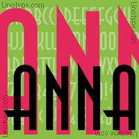
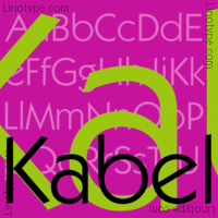
Almost by definition, Art Deco meant sans serif type. The most common such face is Avant Garde (1974, Lubalin), which is striking but hard to read at length. A more graceful geometric sans is Futura (Renner, 1927-39). There are also more quirky faces in this category, such as Kabel (Koch, 1927-30). A recent popular Art Deco display face is ITC Anna (1991 – ?). A stunning example of a modern Art Deco font in use can be found at the Letterheads web site.
Fat Faces
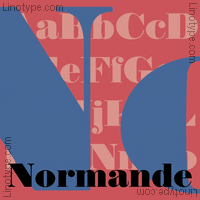
The “Fat Face” types were an offshoot of the moderns, intended for display purposes (that is, to be attention-getting for use in large sizes, particularly advertising). The first such types appeared from 1810-1820. They further exaggerated the contrast of modern typefaces, with slab-like vertical lines and extra emphasis of any vertical serifs, which often acquired a wedge shape. Bodoni Ultra, Normande and Elephant are all examples of fat face types which are closely based on early to mid-19th Century originals, and are available in digital form.
NEXT : Script, Brush, Italic & Freehand“
See 68 of the fonts mentioned in this History of Typography in our Typography Gallery
thanks for reading
![]()
Editor/Publisher : DTG Magazine, Published online since 1988
Don’t forget … we encourage you to share your discoveries with other readers:
![]() Send an email to our editorial staff
Send an email to our editorial staff
![]() Follow DTG on Facebook!
Follow DTG on Facebook!
![]() PIN THIS with DTG on Pinterest
PIN THIS with DTG on Pinterest
![]() Fred Showker, Design on pinterest
Fred Showker, Design on pinterest
This page was originally published at : https://graphic-design.com/wp-content/uploads/graphic-design.com/Type/history/display_type.html