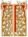
Let’s take a look at the real value of building color palettes from the past. The Art Nouveau and Victorian periods were so rich in color, and decorative qualities that they hold a cherished place in art history. Try your hand at utilizing those color combinations to develop your own… just in time for spring!

THE ART OF COLOR is a difficult art to learn, and apply. So many people today think they can design a pleasing color palette, but really cannot. I could name quite a few, right now, but I won’t. Often times, even designers don’t know where to start when developing a color palette — as evidenced by the many posts over the years in both the Design Cafe and WebDesign lists.
The best practice for both professional and amateur designers is to build a visual color vocabulary based on history. The Art Nouveau and Art Deco periods in art broke new ground in color harmony. It wasn’t that they developed anything different than their predecessors, but that they looked at color and color combinations somewhat differently. The Art Nouveau era produced a new generation of artistic decoration the world had never seen.
Here are just three of the many Dover books that can be purchased for very little, yet can provide a world of forgotten color palettes for just about any mood and message the designer might wish to portray. The slick skill is in interpreting these decorative images, and applying them to your own projects.

Full-Color Art Nouveau Designs and Motifs
This book offers an incredible array of borders, panels, scrolls, wall friezes, and other design elements — selected from a rare early-20th-century stylebook. It’s not necessarily about the configurations for the color designer — but rather the way the combinations were built to produce a feeling.

Once a color family is selected, the designer can experiment with color hue, intensity and value by simply changing the levels. In Photoshop or Photoshop Elements, select Layer > New Adjustment Layer, and utilize Levels or Hue/Saturation to slightly or dramatically adapt the palette to the project. In the illustration above, the first block (left) was the wonderfully pastel vision of the original artist.
This sample provides a superb palette of tans, greens and steely blues.
The
Full-Color Art Nouveau Designs and Motifs CD-ROM and Book contains a vast assortment of motifs, among them tangled ivy vines and voluptuous sprays of tulips and lilies; sea life, parrots, and peacocks; and lovely women with flowing tresses, all sensually rendered in subtle hues. 317 full-color illustrations.
In this sample, we see a selection of tapestry style border motifs that alone can fuel 100 palettes. This sample page shows a myriad of color palettes in use through both motifs and imagery.
Full-Color Allover Patterns

Patterns is another area where the artist must harmonize colors, or else the art fails. Over the Art Nouveau period the screen printing industry cranked up to produce a dazzling array of fabrics and wallpapers never before imagined.

Notice how the best patterns are composed of “bed” colors combined with one or two “accent” colors. Above we see a series of tiles that at first glance look very similar in color family. But look closer, and the real dynamics of these color palettes is in the accents. Orange or pastel teal made superb accents against a field of tans, ochres and browns.
The
Full-Color Allover Patterns CD-ROM and Book goes beyond Art Nouveau, and presents a collection of rare patterns spanning the 15th through 20th-century. Some are related color families, utilizing geometrics, florals and foliates. On other pages you will be stricken with blazing color combinations, encompassing a rich variety of colorful subjects and styles. All are royalty-free for use in designing catalogs, book covers, stationery, greeting cards, and other print projects.
Owen Jones Decorative Borders
Looking into the history of ornament and decoration provides another rich hunting ground for spectacular color palettes. Book illustrators and illuminators throughout history have provided us with a vast heritage to call upon.

Creator of The Grammar of Ornament, Owen Jones ranks among the Victorian era’s most admired designers. In history, the pace of life and cost of living was such that thousands of hours could be spent in careful pen and color work. Some of the samples are absolutely beautiful.

As you can easily see from this sample, the Owen Jones Decorative Borders CD-ROM and Book can add a new dimension to your resource library. The collection features 227 of his colorful borders, panels, and initials from The Book of Common Prayer, The Psalms of David, and Lockhart’s Spanish Ballads.
Color: Borrowed from days gone by
So, the next time you’re hung for a color palette, revisit this article and check out any of these wonderful books. All come with a CD-ROM or DVD of images, and they’re all priced under 20-bucks. How can you go wrong!
Thanks for reading. . .
And, thanks for reading
Editor/Publisher : DTG Magazine
+FredShowker on Google+ or most social medias @Showker
Published online since 1988
Don’t forget … we encourage you to share your discoveries with other readers: ![]() Send an email to our editorial staff
Send an email to our editorial staff![]()
![]()
![]()
![]()
![]()
![]()
![]()
![]()
![]()
![]()
![]()
![]()
![]()
![]()
![]()
![]()
![]()
![]()
![]()
![]()
![]()
![]()
![]()
![]()
The original version of this article was published at : https://graphic-design.com/wp-content/uploads/graphic-design.com/DTG/Design/art_nouveau_color/index.html