2011 looks brighter already Honeysuckle, a sherberty, intense shade of pink with a hint of red and orange zest, is the hot new hue and is beginning to pop up everywhere. Now, make the paper part of your color designs

Incorporating the 2011 Pantone color of the year
![]() 2011 looks brighter already! Honeysuckle, a sherberty, intense shade of pink with a hint of red and orange zest, is the hot new hue and is beginning to pop up everywhere. As Pantone’s 2011 color of the year, this color is being described as ‘a brave new color for a brave new world.’
2011 looks brighter already! Honeysuckle, a sherberty, intense shade of pink with a hint of red and orange zest, is the hot new hue and is beginning to pop up everywhere. As Pantone’s 2011 color of the year, this color is being described as ‘a brave new color for a brave new world.’
Honeysuckle is courageous, captivating and stimulating — the perfect inspiration for any designer. The intensity of honeysuckle lures the eyes of consumers and adds a lively flair to design, including printed graphics. Whether you pair honeysuckle with other colors to make it pop, print it on colored or textured paper, or simply add subtle hints to design, incorporating this color makes a definite splash.

Images courtesy of College Candy
When working with printed graphics, it’s important to choose the right paper to showcase honeysuckle in all of its glory. After all, paper is an additional color when you’re designing for print. Case in point, the same ink printed on 15 different stocks will produce 15 different hues — so choose wisely, and always be sure to test before fully employing.
There are a number of ways to incorporate this year’s color into design. Try the following tips and techniques to bring out a different facet of honeysuckle to attract the most attention to your projects.

* Make a splash. We all know that cannonballing makes a bigger splash than merely tiptoeing in to water. To make a big impression, use honeysuckle as the main color of your design, using tints and shades to add depth. To keep the color within your design as the main point of focus, print against a neutral or white backdrop, such as
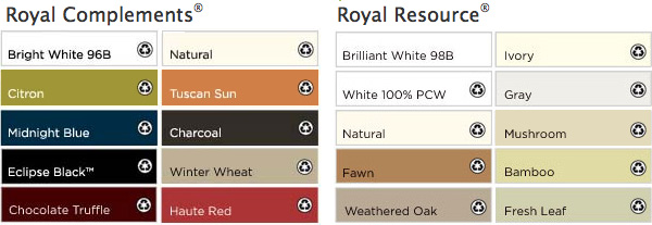
Royal
Resource® Brilliant White. You can also highlight or emphasize the color by printing on a deep, black paper, such as Royal
Complements® Eclipse Black.
* Choose to complement. Honeysuckle pairs nicely with a punchy turquoise, a grape shade of purple and a rich chocolate brown. In addition to incorporating these complementary colors into your project, try printing honeysuckle on a colored paper, such as Royal
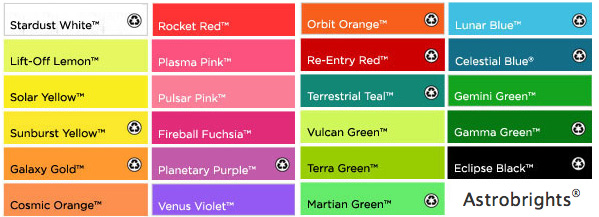
Linen Chocolate Truffle™ or Astrobrights Lunar Blue®.

* Don’t be afraid of contrast. Contrast creates a unique visual element and can truly make a standout design, when used appropriately. Incorporating shades of green will provide a stark contrast, creating sharp lines between the opposing colors. Orange is another option; while the orange and pink hues are contrasting shades, the zesty orange undertones found in honeysuckle will still allow it to blend. If you’re looking for bright, bold paper options to complete your eye-catching design, try using any of the cosmic colors within Astrobrights®.
* Keep it simple. A little bit can go a long way. A pop of color as an accent piece can bring in attention without overwhelming your concept. Try incorporating small hints of honeysuckle with neutral tones to maintain a simple consistency while alluring visual attention. To enhance or highlight your printed graphic, try a beautiful, shimmery paper in a neutral shade, such as Royal
Metallics® Champagne Pearl™.
* Feel the difference. Never underestimate the appeal of drama. To add a layer of appeal to an already lively hue, try printing on textured paper. Not only does the feel of it draw attention, but the appearance of an uneven surface adds visual interest. Use Royal Resource® Bark Finish to give your design the attention it deserves.
Whatever your design style, there’s an option for you. So be courageous and allow the spirit of honeysuckle to inspire you and your designs throughout 2011.
Andrea Alstad
![]()
www.wausaupaper.com
![]()
Pantone Honeysuckle page
![]()
College Candy blog: fashion honeysuckle orgy
 Andrea Alstad is the manager of strategic markets, print & color for the paper segment of Wausau Paper, a leading manufacturer of colored uncoated printing and imaging papers. For more information, visit www.wausaupaper.com.
thanks for reading. . .
Don’t forget … we encourage you to share your discoveries with other readers. Just send and email, contribute your own article, join the Design Cafe forums, or follow DTG on Facebook!