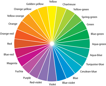
All colors, shades and combinations evoke different emotions, so it’s important to make sure you’re creating the intended message with your color selection… now, Andrea Alstad shares some insight into color — along with free downloadable color inspiration and an Illustrator color wheel…

![]() Splashes of bright color are springing up in fashion and interiors this year, and you can bet that we’ll also see this trend in graphic design. A change from chic neutrals, colors show character and add layers of excitement. But which colors are best to employ, and does it matter?
Splashes of bright color are springing up in fashion and interiors this year, and you can bet that we’ll also see this trend in graphic design. A change from chic neutrals, colors show character and add layers of excitement. But which colors are best to employ, and does it matter?
All colors, shades and combinations evoke different emotions, so it’s important to make sure you’re creating the intended message with your color selection.
Successful design requires an awareness of how and why colors communicate meaning. Emotions, memories, ideas and thoughts are triggered by color every day. Color psychologists agree that different colors convey meaning through natural and cultural associations, and they can have both positive and negative symbolism. When it is used correctly, color can add tremendous impact to a design objective.
Color creates dramatic effects, even when used minimally. Incorporating splashes of color into a design printed on a neutral backdrop can be just as magical as using vivid, colored paper as your background. Color will not only provide additional visual excitement for the viewer, but it can even boost memory of the graphic; therefore, maximizing the impact of your design.
In order to identify which colors will help achieve a desired outcome, it is important to understand color associations. According to color experts, each color triggers various emotions!

Here you go : looking for ideas? Click on the above tiles to see lots of colorful ideas!
Cool Blue: Our eyes focus most easily on the color blue, so it’s no wonder blue is a favorite color choice among all age groups. It generates feelings of tranquility, love, acceptance and understanding. Yet, this color can also create feelings of fear, coldness, passivity and depression. Depending on the message you wish to convey, either of these associations can work in your favor.
For a campaign discussing unfortunate situations, coordinating a cool, ashy-blue with shades of gray can enhance your message while playing off the emotions of your audience. Using lighter shades with a vivid blue allows the positive associations to shine through, such as incorporating splashes of white, tan or light green.
Orange You Glad. On the other end of the spectrum, orange has positive associations of courage, cheerfulness, warmth and excitement. Call out orange’s warm associations by pairing it with a java brown, a deep red or a soft cream. To bring out orange’s exciting characteristics, use a zesty orange against a white backdrop, or print drops of yellow and green on an orange paper stock to add a lively flair.
Hello Yellow. This spring, you can expect to see an abundance of yellow. It’s the brightest hue and naturally calls to mind memories of spring. Invoking happiness and joy, yellow is great for design as it has proven to have the strongest emotional impact. Printing on yellow paper is a great way to get a rich hue and is typically easier on the eye than printing a process yellow on white stock.
For a more subdued message, tone the color down by pairing it with a charcoal gray or black. If you’re going for a vibrant or modern look, spruce it up by complementing yellow with a punchy orange or splashing hot pink and lemony yellow against bright white.
Lights & Darks. The specific shade variation of a color is also important, as dark and light shades of any color convey completely different meanings. This is true of pink, which loses all of red’s associations with energy and takes on a new connotation of tenderness and sweetness. Likewise, lavender represents grace, elegance and femininity, opposing purple’s reflection of royalty and religion.
Color Pairs. Colors also take on new meaning when paired in different combinations. As a standalone hue, green sooths while triggering a sense of hope and freshness. When paired with blue, the combination reflects themes in nature, often inspiring growth. Coupled with red, the contrasting colors are lively and festive.
Incorporating color makes a definite impact. If a picture is worth a thousand words, a picture using a well thought-out color scheme may be worth a million. For every unique design need, there’s a way to incorporate beautiful hues to enhance the design’s objective.
Andrea Alstad
The Color Wheel : Click to view the color wheel full size, copy for your own use!
![]()
Download the color wheel PDF – right-click : color_wheel.pdf
![]()
![]()
![]()
![]()
Download Adobe Illustrator – right-click: color_wheel.ai, native AI file you can edit!
![]()
![]()
![]()
![]()
Get a LOAD of color from Wausau’s collection of ultra-bright papers!


thanks for reading. . .
Don’t forget … we encourage you to share your discoveries with other readers. Just send and email, contribute your own article, join the Design Cafe forums, or follow DTG on Facebook!


